
Welcome to the first Drawing New York Newsletter.
Thanks to the 16 students who joined us at our classroom in New York City for this lesson. We spent the evening on one question: where does the viewer’s eye go first?
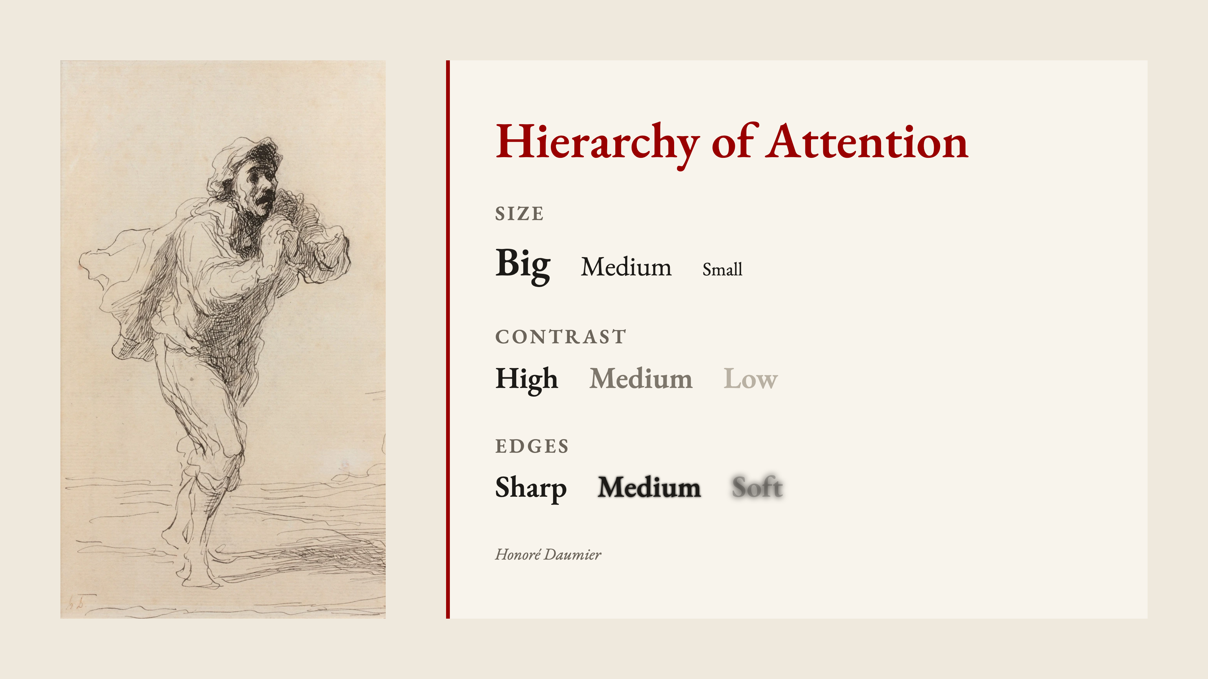
Three tools
- Size: big, medium, small
- Contrast: high, medium, low
- Edges: sharp, medium, soft
Then we followed those tools through four master drawings by Daumier and Munch.
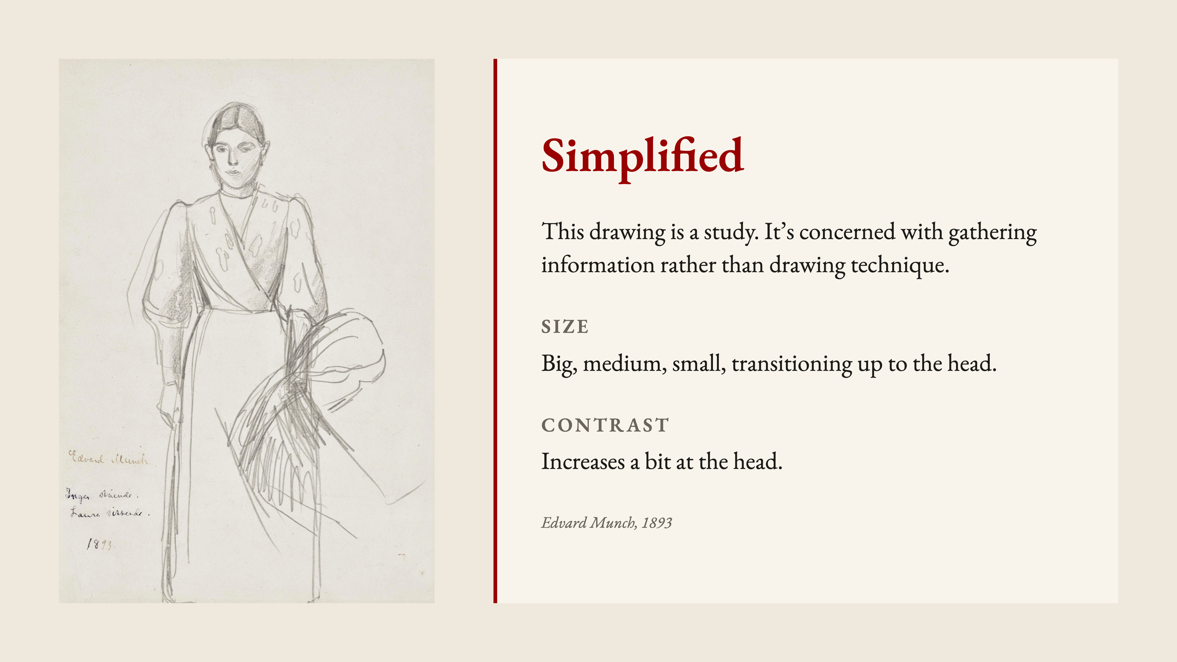
Simplified
This Munch drawing (1893) is a study, more concerned with gathering information than with drawing technique. Still, the shapes step from big to medium to small up to the head, where contrast increases a bit.
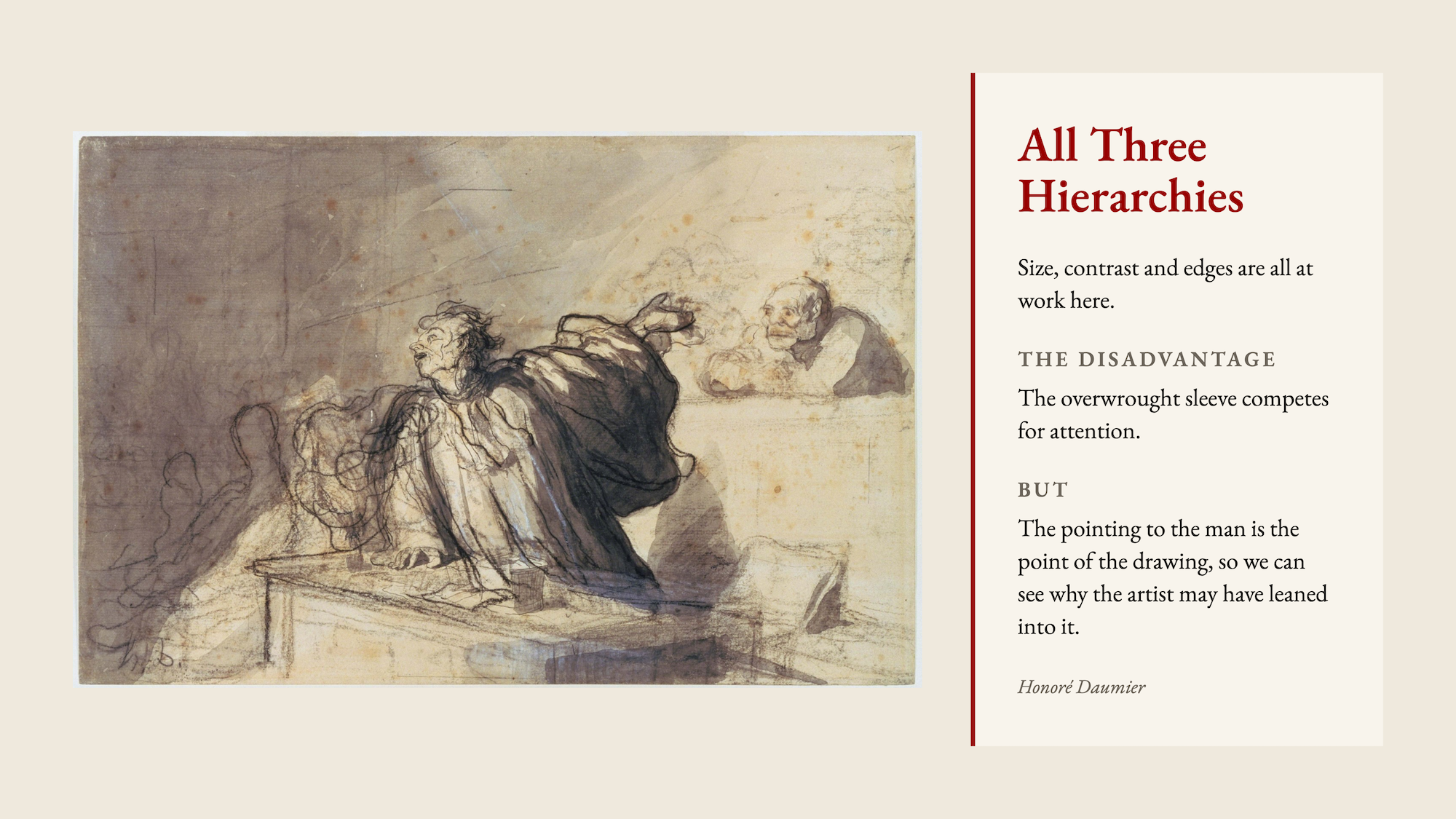
All three hierarchies
In this Daumier, size, contrast and edges are all at work. The overwrought sleeve competes for attention, but the pointing to the man is the point of the drawing, so we can see why the artist may have leaned into it.
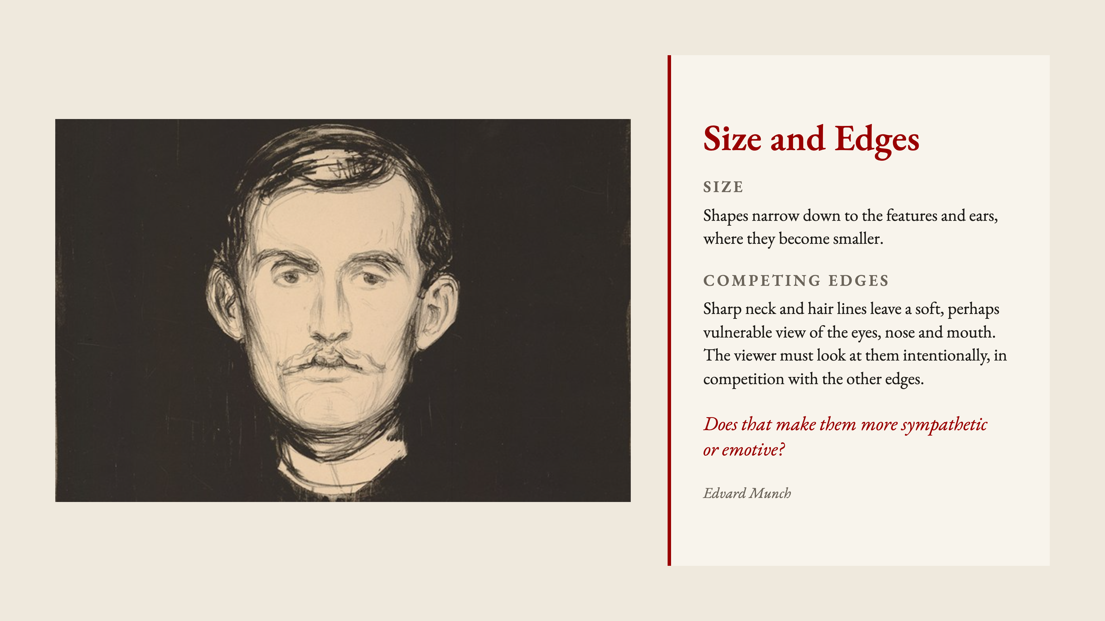
Size and edges
In this Munch self-portrait, the shapes narrow down to the features and ears, where they become smaller. The sharp neck and hair lines leave a soft, perhaps vulnerable view of the eyes, nose and mouth. The viewer must look at them intentionally, in competition with the other edges.
Does that make them more sympathetic, or more emotive?
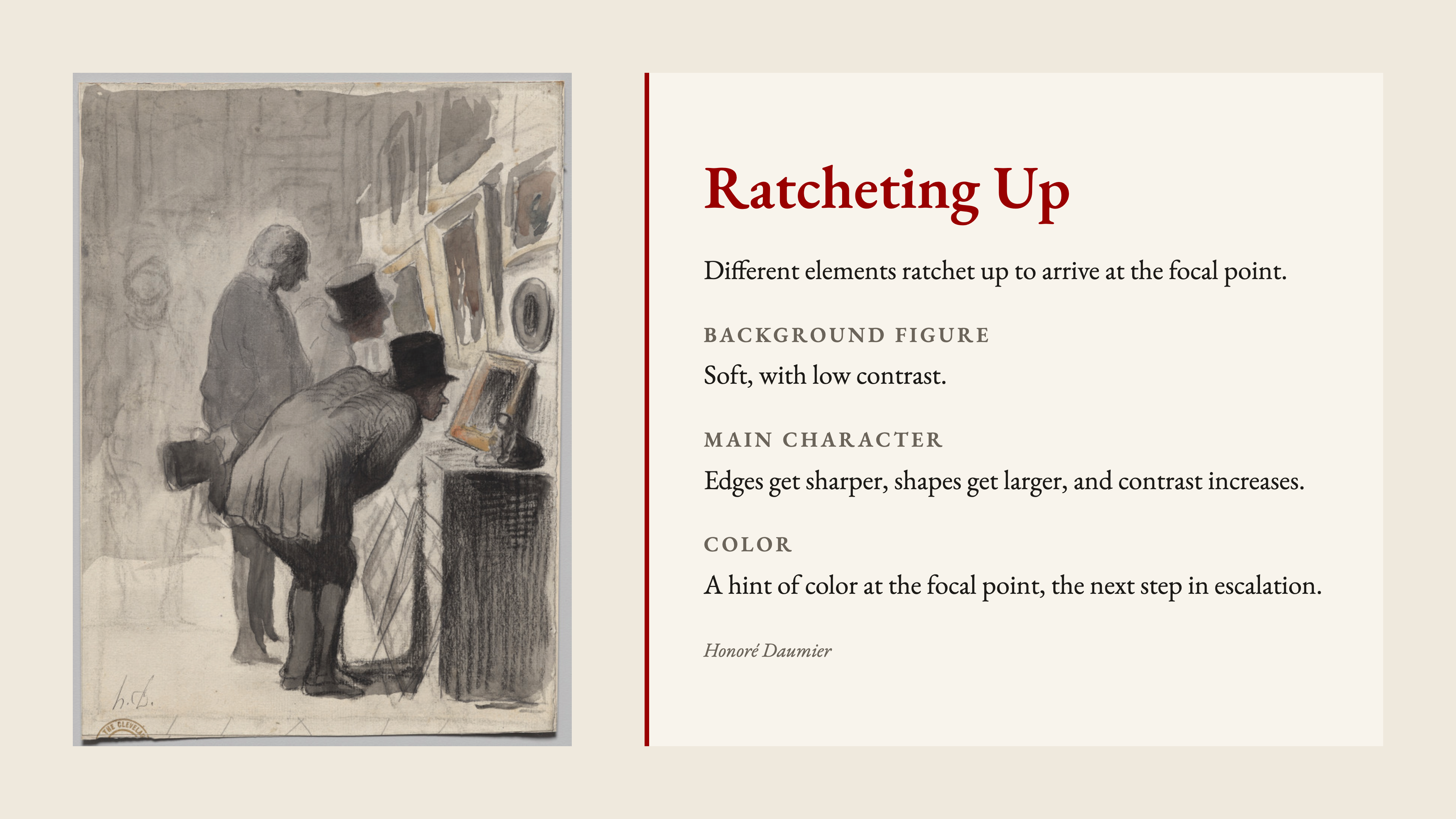
Ratcheting up
In this Daumier, different elements ratchet up to draw attention to the focal point. The background figure is soft and low-contrast. On the main character, the edges get sharper, the shapes get larger, and the contrast increases. The artist even added a hint of color at the focal point, the next step in escalation.
Try it at your next session: before you draw, decide where you want the eye to land, then give that spot the biggest shapes, the highest contrast, and the sharpest edges.
See you in class,
Simon

Responses